Web design and Art Direction.
Scope
Year

/
Art Direction
(01)
Redefining clarity through visual language
For me, art direction begins with observation; understanding how light, silence, and rhythm can communicate before words do. Every project starts as a search for essence: what feeling should remain after everything unnecessary is stripped away? Through this lens, I approach visual composition not as decoration, but as emotional architecture, a way of guiding how people see, pause, and feel.


/
Balancing structure and spontaneity
(02)
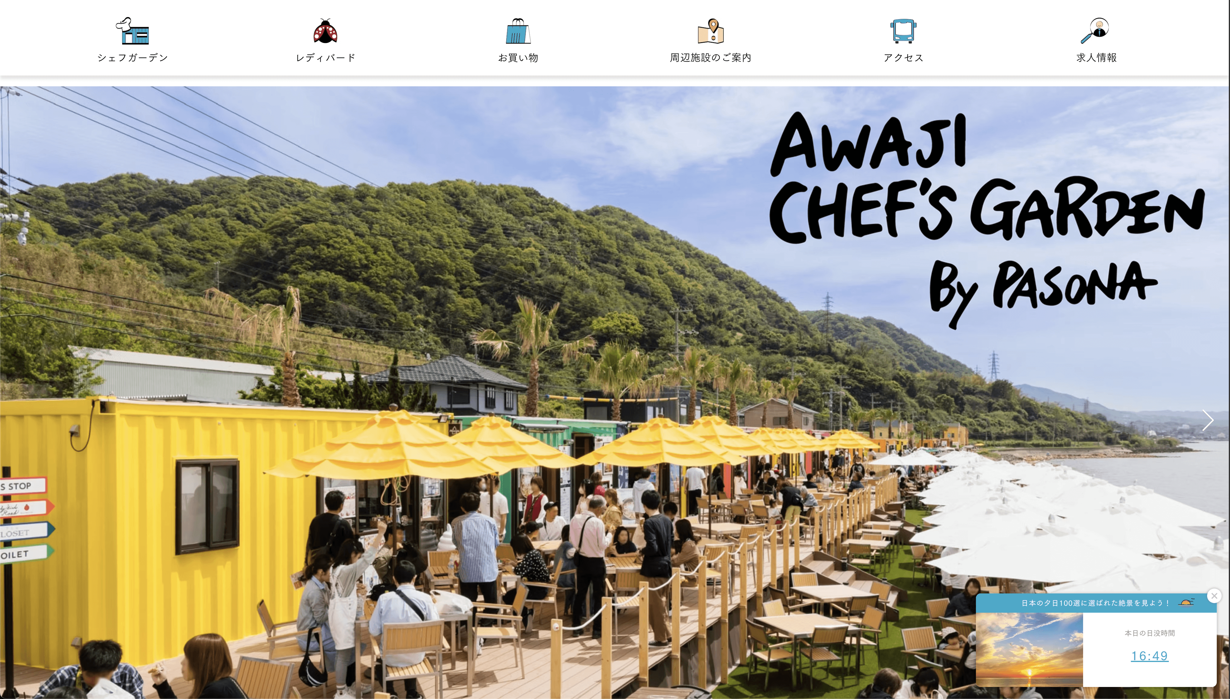
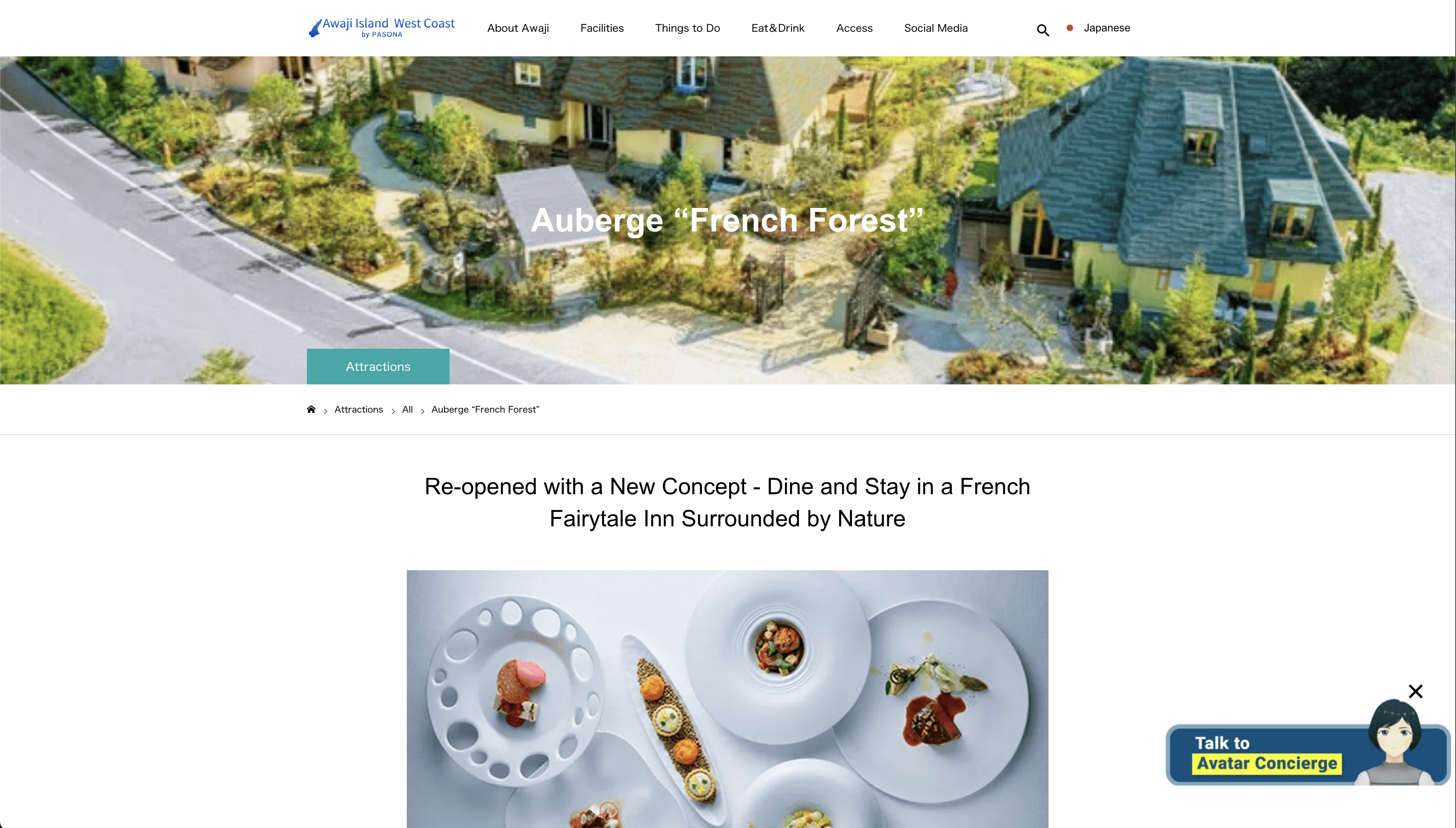
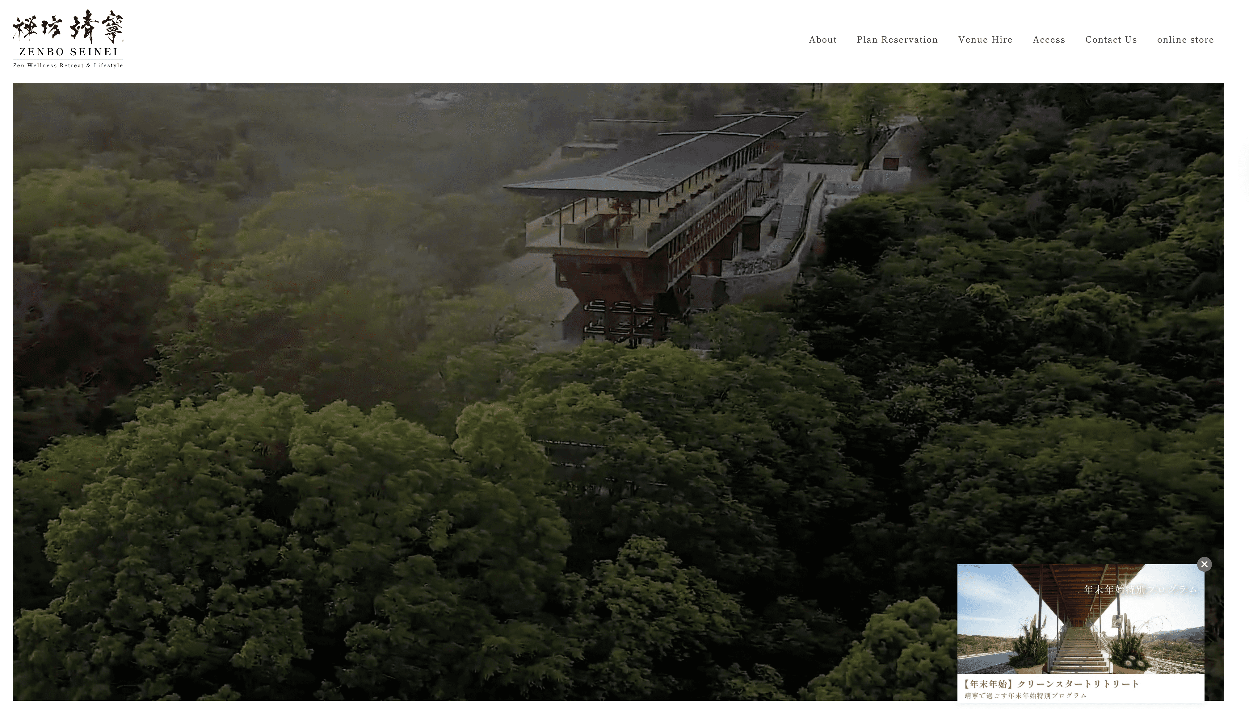
I led IA and interaction design across the destination’s pages: restaurants, visitor itineraries, and hotels. Deliverables included a shared design system (type, color tokens, spacing), reusable cards, map and filter patterns, and optimized booking flows. Content is modular for seasonal campaigns, keeping discovery intuitive and conversion paths clear.
I designed UI/UX patterns that make Awajishima feel discoverable at a glance: clear information architecture, image-led cards for restaurants and hotels, and gentle motion that guides the eye. Menus, maps, and booking flows are one tap away, so visitors move from curiosity to action without friction.
https://en.awajishima-resort.com/awaji-island-promoting-youth-driven-regional-revitalization/
https://www.pasona-hrhub.co.jp/
https://senshinwaho.com/en/
https://zenbo-seinei.com/en/
https://www.awaji-chefgarden.com
https://en.awajishima-resort.com/shop/frenchforest
https://awaji-youth-federation.com/

/
Clarity by design
(03)
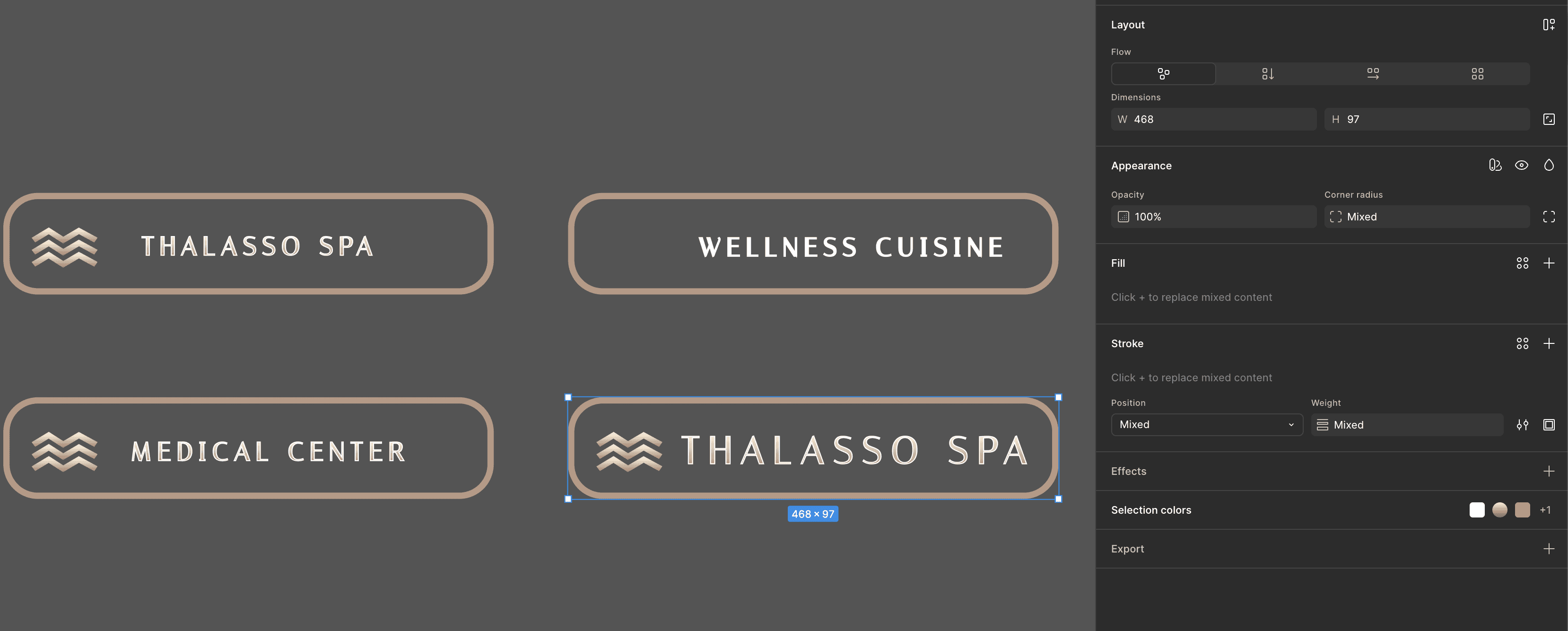
Every color, type scale, and motion cue was chosen to guide decisions, not decorate. The system is responsive, adaptive, and intuitive to navigate, clear hierarchy, generous spacing, and predictable patterns that let visitors move from discovery to action with zero friction.
Built a tokenized design system (color/typography/spacing/motion) with AA–AAA contrast, responsive breakpoints, and reusable navigation patterns. I set the art-direction rules—light and texture treatment, use of negative space, photo framing, icon style, and seasonal accent colors so restaurants, visitor guides, and hotels feel related yet distinct. Clear states, soft transitions, and progressive disclosure reduce cognitive load, while sticky CTAs keep the next step visible without shouting. A shared component library and content style guide ensure consistency across teams and campaigns. The result is an adaptive, accessible interface, JP/EN ready—that feels calm, premium, and easy to navigate, letting the brand’s story and content lead.

Latest Projects.
© Kanso Studio
A curated selection of projects that reflect our commitment to simplicity and purposeful design.

