Logo Design.
/
Logo Design
(01)
Crafting symbols that breathe meaning
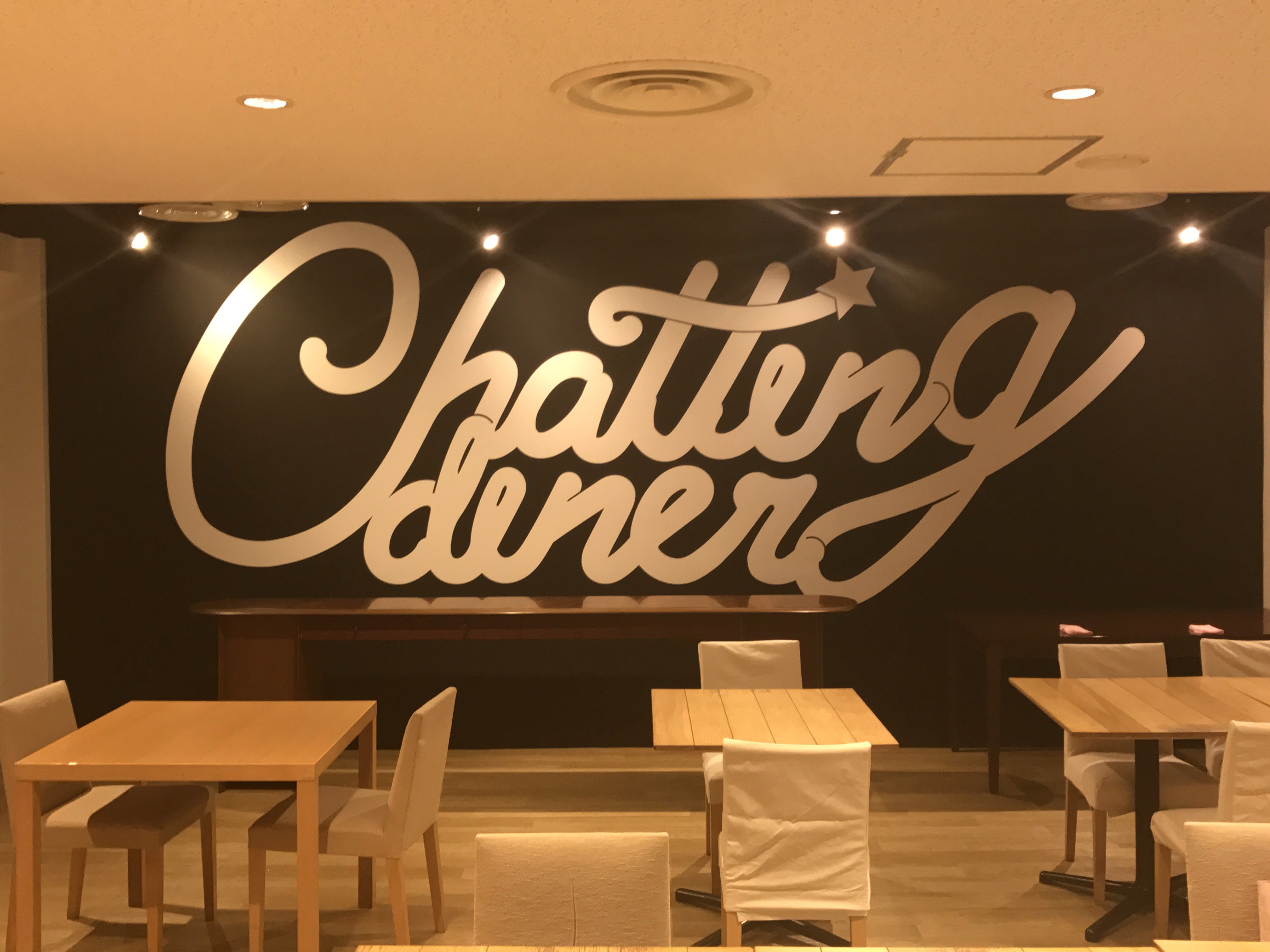
Every logo I design begins as a quiet question: What truth defines this brand? I distill that truth through form, rhythm, and balance、where geometry meets emotion. My process values reduction, not emptiness; every curve, angle, and space serves a purpose. The result is more than a mark—it’s a distilled identity that speaks without needing to explain.


/
Where clarity meets character
(02)
I explore through sketches, experimenting with proportion, negative space, and contrast until the symbol feels inevitable, something that could not exist any other way. Typography is treated as architecture, not decoration, ensuring harmony between the word and its form. Whether for a brand, artist, or space, my goal is the same: to create an emblem that feels timeless, precise, and alive.


/
Conclusion
(03)
A logo, to me, is a form of silence that speaks. It doesn’t chase attention. It earns it through balance, presence, and restraint. My work aims to design marks that live naturally in any space: adaptable, human, and timeless. Each one carries a quiet intention to remind us that clarity can be emotional, and simplicity can move us just as deeply as complexity.

Latest Projects.
© Kanso Studio
A curated selection of projects that reflect our commitment to simplicity and purposeful design.

